Demystifying the Coronavirus Community Dashboard
As part of AUC’s ongoing efforts to mitigate the risks of COVID-19 and provide a safe campus community, the University developed the Coronavirus Community Dashboard to provide useful data for the community. News@AUC spoke with Hassan Azzazy, distinguished University professor, chair of the chemistry department and head of AUC’s Scientific Advisory Committee, which provides scientific recommendations that inform the COVID Response Task Force’s decisions on coronavirus measures and guidelines; Iman Megahed, associate vice president for digital transformation and chief strategy and knowledge officer; and Dr. Bassem Gamil, director of the New Cairo clinic, to learn more about the dashboard.
Also, tune in to our upcoming Campus Conversation on December 9 for a deep dive into the Coronavirus Community Dashboard.
1. When and why was the dashboard established?
Megahed: The COVID-19 dashboard was built in June 2020 to support AUC in monitoring the situation and making informed decisions. In November 2020, AUC decided to publish the dashboard on the University website for complete transparency with its internal and external community members. It was refined after benchmarking with the best practices of other American higher education institution to yield meaningful trends.
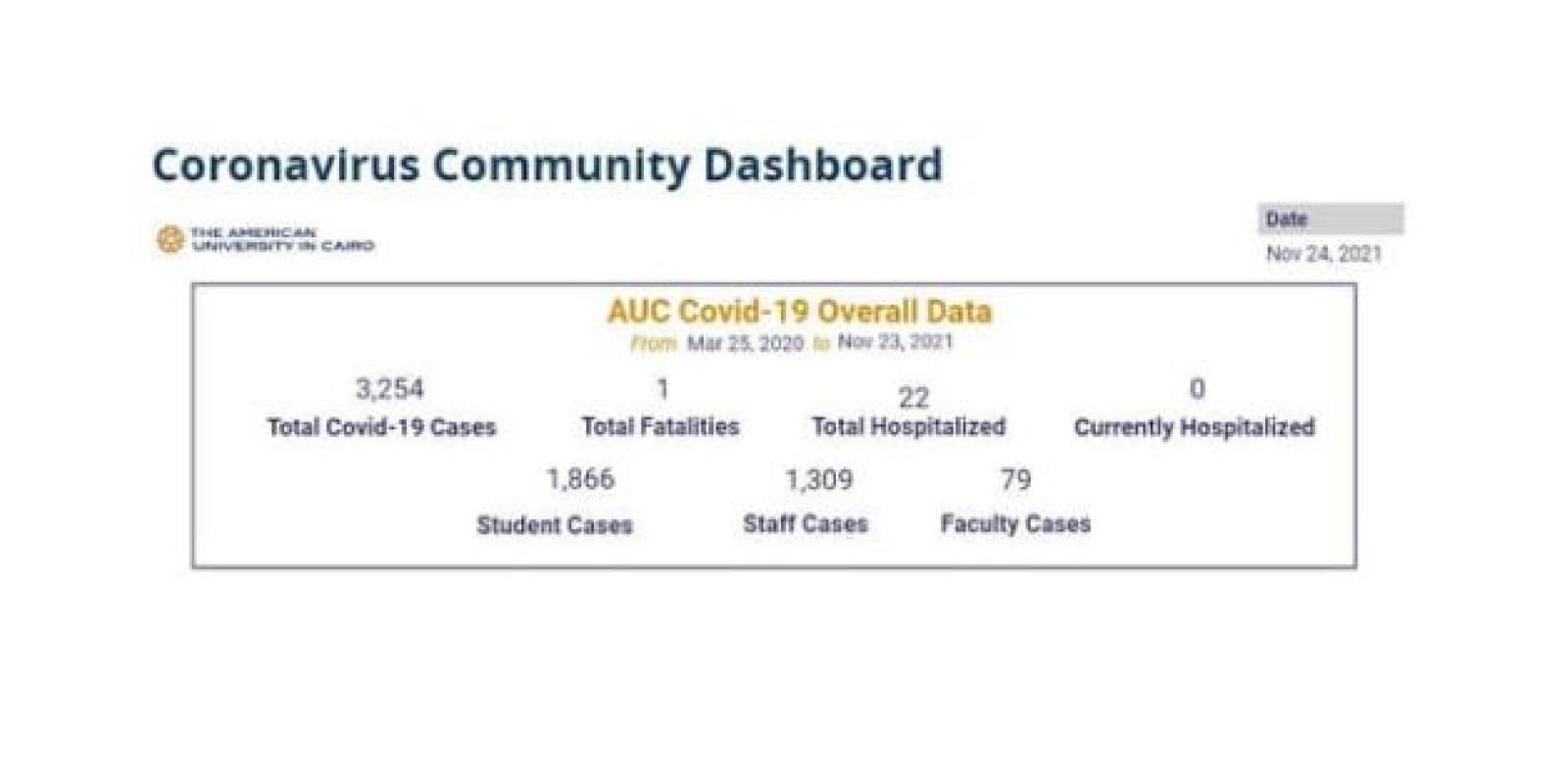
2. What can you tell us about the science behind the dashboard?
Megahed: The dashboard is the visual display of all the data that AUC has on the current situation of the COVID-19 pandemic. The dashboard is sitting on its own page and receives data from a linked database that integrates information through automated scripts from different data sources: COVID-19 Management Application, WiFi Contact Tracing, and google sheets that hold data about Egypt’s KPIs and campus access. The dashboard is the tip of the iceberg, you may say. It was initially designed after researching what other institutions are presenting and evolved to this current design as a result of iterations of modification requests made by the senior administration to support it in making informed decisions.
3. How often is the dashboard content refreshed?
Megahed: The dashboard used to get refreshed twice daily: at 6 am and 1:30 pm. This has recently changed to a single refresh per day at 11 am for simplicity.
4. What’s the difference between the 7-day and 14-day rolling average?
Azzazy: Rolling average, regardless of 7 or 14 days, is a moving window where the number of new cases over 7 or 14 days is added and then divided by either 7 or 14. Each day, the new cases replace the cases of 8 or 15 days ago, and a new average is calculated (remember, a moving window of 7 or 14 days). The 14-day rolling average is recommended by the Minnesota Department of Health for Institutes of Higher Education, and it represents a broader look at the transmission trend. The 7-day rolling average was proposed by AUC at the beginning of the infection (possibly as a guestimate similar to the 15 new cases cutoff).
5. The Scientific Advisory Committee recommended adding the 14-day rolling average. Why is that? And why do we keep the 7-day rolling average?
Azzazy: Based on what the best practices were in the early days of the pandemic, we began tracking the 7-day rolling average. We now understand that using a 14-day rolling average, which is suggested by the Minnesota Department of Health Recommendations for Institutes of Higher Education, will give us a more precise (broader) understanding of the trends. We felt it is best not to remove any elements from the dashboard that people have become familiar with. So we decided to add the additional element of 14 days to provide access to the data, which is now informing our decisions.
6. How is the “COVID-19 rolling average” calculated?
Megahed: The rolling average is the average of the last n values in a dataset. That is, in the very last 7 days, we add up the total number of COVID-19 cases reported during the same period, and it gets divided by 7.
7. What are the “on-campus WIFI contacts?” How does this work?
Megahed: “On-Campus WiFi Contacts” counts all unique Wi-Fi connected contacts who remained within a 2-meter distance of the infected individual for at least 15 minutes during his or her infection period, counted as a 7-day or 14-day total. Upon adding a new case by the clinic on the COVID-19 Management Application, an automated script is triggered to sift through AUC WiFi Big Data streams to generate this list of contacts who meet the aforementioned criteria.
8. “Campus Community Trends” show, on average, 1% or less of confirmed cases compared to the campus population. What does this signify?
Azzazy: There are some upward and downward trends, but overall, it is around 1%. It could mean a few things, including a more or less steady number of new cases since September 2020.
9. What do the CT scan figures mean to the AUC community?
Gamil: CT scan figures represents the number of negative PCR cases that underwent the procedure of chest imaging, whether or not they show pulmonary (lung) symptoms. It is the number of cases referred for CT scan of the chest for assessment by their medical provider to explore the possibility of pulmonary (lung) involvement in spite of a negative PCR result.
10. Can the dashboard show what stage we’re at (out of the four stages identified by the Scientific Advisory Committee) in terms of transmission levels on campus?
Azzazy: The dashboard is a presentation of current data and trends. We have not included the stages on the dashboard, as the stages represent how we may apply the data. We should also allow for the possibility that as research continues and new information becomes available, we may need to apply flexibility in how we define these stages.
11. How do the figures on the dashboard affect decision making regarding COVID-19 safety measures on campus?
Azzazy: They do so through correlation with the four-stage approach as well as indication of national transmission levels. Both factors contribute to the decision on the current stage of the four recommended by the Minnesota Department of Health.
12. What do the figures tell us about COVID-19 safety measures on campus?
Azzazy: Absence of major spikes in new cases indicate that current measures (especially inside classrooms with social distancing, mandatory masks and fresh air ventilation) are satisfactory, but there is a need to be more vigilant to prevent the current numbers from increasing, especially when the temperature goes down: moving activities indoors and increasing chances of transmission.
13. How does the dashboard support AUC’s data-driven approach to decision making?
Azzazy: It is definitely informative and timely. Daily updates and the 14-day rolling average are important to get a clear picture on daily developments as well as trends of transmission, respectively.